Getting started with Tailwind css


What is Tailwindcss?
Tailwind CSS is basically a utility-first CSS framework for rapidly building custom user interfaces. and its packed with classes like flex, pt-4, text-center and rotate-90 that can be composed to build any design easily. Tailwind CSS makes it quicker to write and maintain the code of your application.
Installation
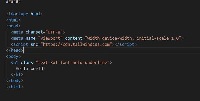
we can directly use the Play CDN to try Tailwind right in the browser without any build setup. 1.Add the Play CDN script tag to the of your HTML file, and start using Tailwind’s utility classes to style your content. <!doctype html>
Hello world!
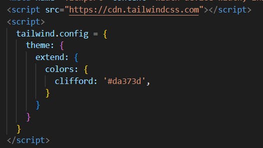
2.Try customizing using config
Edit the tailwind.config object to customize your configuration with your own design tokens.
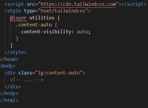
3.Use type="text/tailwindcss" to add custom CSS that supports all of Tailwind's CSS features.
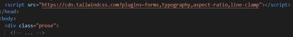
4.enable first-party plugins, like forms and typography, using the plugins query parameter.
Core concepts
Utility First Fundamentals
Building complex components from a constrained set of primitive utilities. Usually when we apply styles to something we use css but with tailwind we style elements by applying pre-existing classes directly in your HTML. There are many shortcuts so we can style faster .
For flexbox and padding we can use (flex, shrink-0, and p-6) to control the overall card layout and for max-width and margin utilities (max-w-sm and mx-auto) to constrain the card width and center it horizontally. The background color, border radius, and box-shadow utilities (bg-white, rounded-xl, and shadow-lg) to style the card’s appearance.
Hover,Focus,Other states.
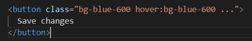
For hovering any item we can use below example. For example, to apply the bg-sky-700 class on hover, use the hover:bg-sky-700 class:
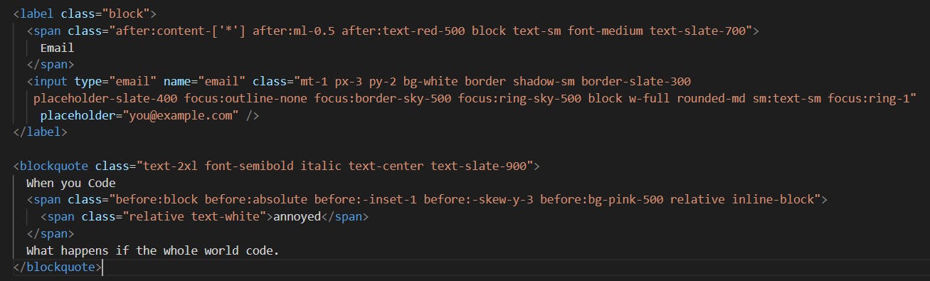
 Style an element when it is the first-child or last-child using the first and last modifiers
Style the ::before and ::after pseudo-elements using the before and after modifiers
Style an element when it is the first-child or last-child using the first and last modifiers
Style the ::before and ::after pseudo-elements using the before and after modifiers
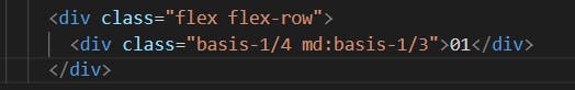
Responsive breakpoints. To style an element at a specific breakpoint, use responsive modifiers like md and lg.
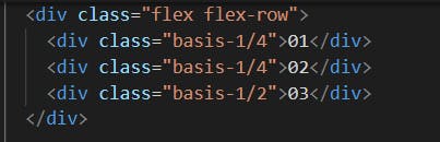
Flexbox
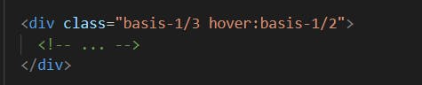
Use the basis-{size} utilities to set the initial size of flex items.
Class properties
basis-0 flex-basis: 0px;
basis-1 flex-basis: 0.25rem; / 4px /
basis-2 flex-basis: 0.5rem; / 8px /
basis-3 flex-basis: 0.75rem; / 12px /
basis-4 flex-basis: 1rem; / 16px /
 For Breakpoints and media queries.
 For hover
Grid
Use the grid-cols-{n} utilities to create grids with n equally sized columns.
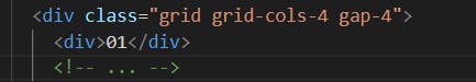 use hover:grid-cols-6 to only apply the grid-cols-6 utility on hover.For Breakpoints use md:grid-cols-6 to apply the grid-cols-6 utility at only medium screen sizes and above.
Typography
Typography is used to change font family, font style etc.., Font Family Utilities for controlling the font family of an element.
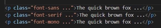 use hover:font-serif to only apply the font-serif utility on hover.
use md:font-serif to apply the font-serif utility at only medium screen sizes and above.
use hover:font-serif to only apply the font-serif utility on hover.
use md:font-serif to apply the font-serif utility at only medium screen sizes and above.